Making analytics usable for people who don't do data
Project
Recruitment Analytics · Teamtailor
Year
2024
Teamtailor's analytics platform, rebuilt. When I took it on it was the most complained-about part of the product. The users are recruiters and hiring managers with no data background, and they had to both read reports and build their own. I redesigned the whole thing so those users could do that without help. Usage went up 31% and within a year it won Forbes Best Analytics Platform in its category.
Impact
31% increase in usage of the analytics platform, isolated from overall product growth
Won Forbes Best Analytics Platform (ATS category)
Signed on new enterprise customers leading to a direct ARR increase
Scope of Work
Data visualisation
UX research
Product design
Data analysis

Why this project started
Teamtailor's analytics platform was the most complained-about part of the product. The users are recruiters and hiring managers, not data analysts, and struggled to read reports and build their own.
This was pre-AI. There was no LLM to explain a confusing metric or build reports. Every bit of definition, aggregation, and meaning had to be carried by the UI itself.
Three business pain points made the case for a full rebuild, not a patch:
low engagement despite clear demand
analytics acting as a churn driver as customers scaled from startup to scale-up
lost enterprise deals to competitors due to limited functionality of existing platform

Key challenges, and how I tackled them
Designing for users with no data background
Challenge: A recruiter needed to answer questions like "where are candidates dropping off" without knowing what a funnel is or how to set one up.
My approach: Every widget is self-explaining and answers a recruiting question people already ask (Pipeline speed, Reject reasons).
Choosing what to surface from the extensive database
Challenge: We were storing far more data than we could put on screen, and dumping all of it on a non-data user would be worse than showing nothing. The challenge was deciding what to surface.
My approach: User research gave me the top questions a recruiter needs answered, and I used those to decide what to show and how. Anything more custom is what the report builder covers, further down.
Bridging how people think about data and how BI tools work
Challenge: Tools like Excel and Tableau make you build a data table first, then turn it into a chart. Our users don't think that way. They don't know what belongs in the table. They only know what they want the chart to answer.
My approach: I built the report builder around how they already think. You pick the chart type and the metrics, and the data table is assembled for you in the background, instead of being the first thing you have to figure out.

Discovery: who am I designing for
Before building anything I ran a full research pass:
Conducted user surveys to uncover expectations.
Held user interviews for direct insights.
Analyzed support chats for pain points.
Performed competitor analysis.
Collaborated with Customer Success for feedback.
Expert UX review assessing user flows for issues and mapping pain points in the journey.
Developed user stories and personas from data.
Three user pain points came out of it, and they set the direction:
Diverse users, one platform. The audience runs from recruiters asking job-focused questions to managers wanting broad insights.
Data was buried. The old platform made you filter and click through several steps to reach a specific answer. It had to be reachable fast.
Too much, badly presented. It leaned toward data overload instead of actionable insight. The fix was to digest the data into readable chunks.


Solution
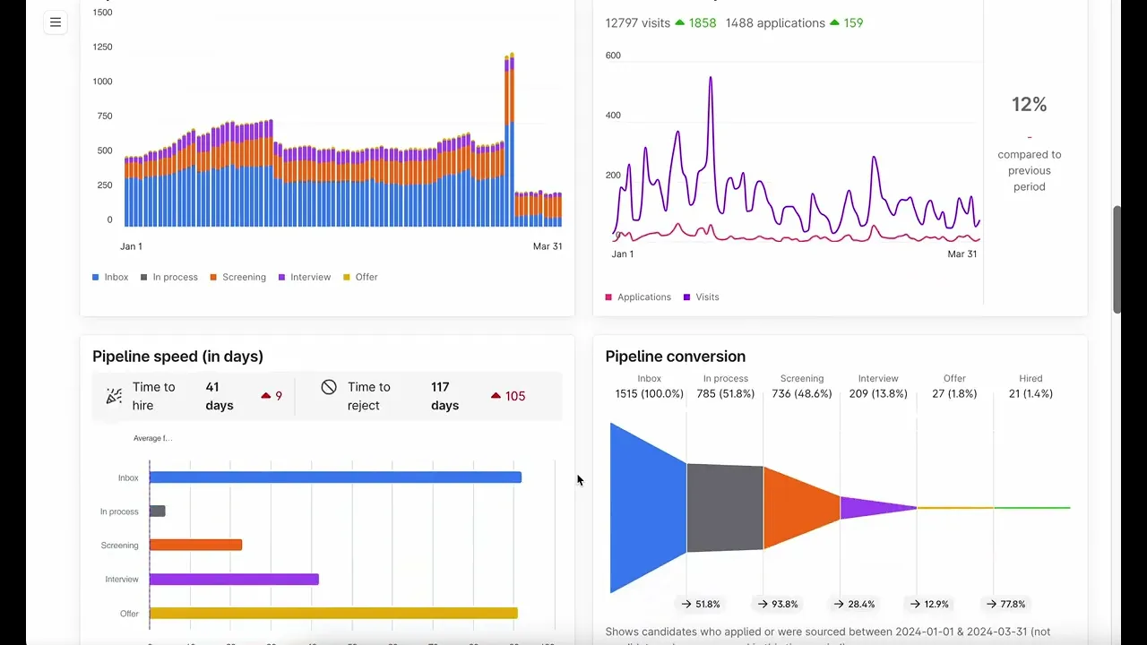
One dashboard with ready-made widgets answering common questions
I took what recruiters actually want to know about their hiring and turned each question into its own widget. For example:
Pipeline speed: helps you understand at a glance which stage of your hiring is taking the longest, without reading a table or working out an average.
Reject reasons: gives you the most common reasons candidates get rejected.
Job ad performance: how a single job ad is doing, how many applications it pulled and how it converted, in one widget.
The design system had no chart or data-visualization components, so I designed all of them from scratch.


Continuous iterations
The platform kept moving after launch. Each of these widgets went through multiple versions based on user feedback.
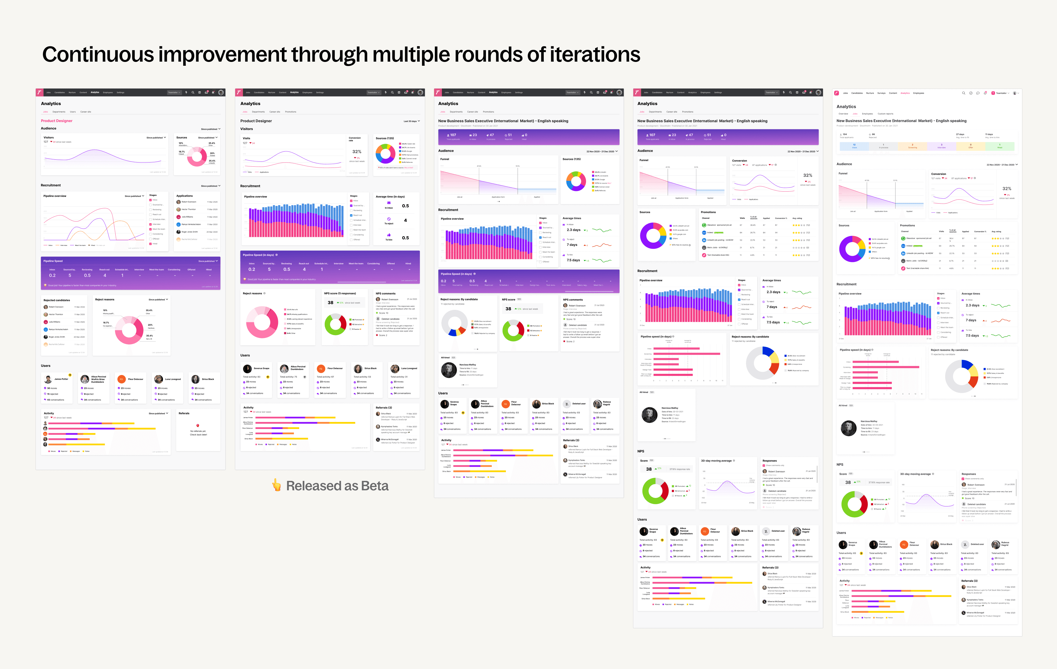
Iteration example 1: Visitors and conversion
First version focused on getting MVP live with visits to the career page over time.
Second iteration displays visits and applications over time and the conversion rate. The conversion metric gives a much better idea of how well a job add is doing.
The last version adds a conversion funnel, providing a clear, step-by-step representation of the conversion process, making it easy to identify drop-offs and optimize the process.

Iteration example 2: Reject reasons
Simple donut chart showing breakdown of reasons why a candidate was rejected.
In the next version, I added a carousel with better categorization. It includes separating those "Rejected by company" vs. "Rejected by candidate" since this was an important distinction. I also added a further breakdown in each category.

Going further: the custom report builder
The gap: The pre-made dashboard answered the common questions, but much more sat in the database that no report showed.
The insight: The data-savvy users were turning to expensive, complicated BI tools to get at it. In user interviews, I looked at what they were actually building there, and the reports were not complex. They were just slightly different ways of visualizing the same data. Users did not need a powerful tool. They needed freedom and flexibility, with the complexity kept out of their way.
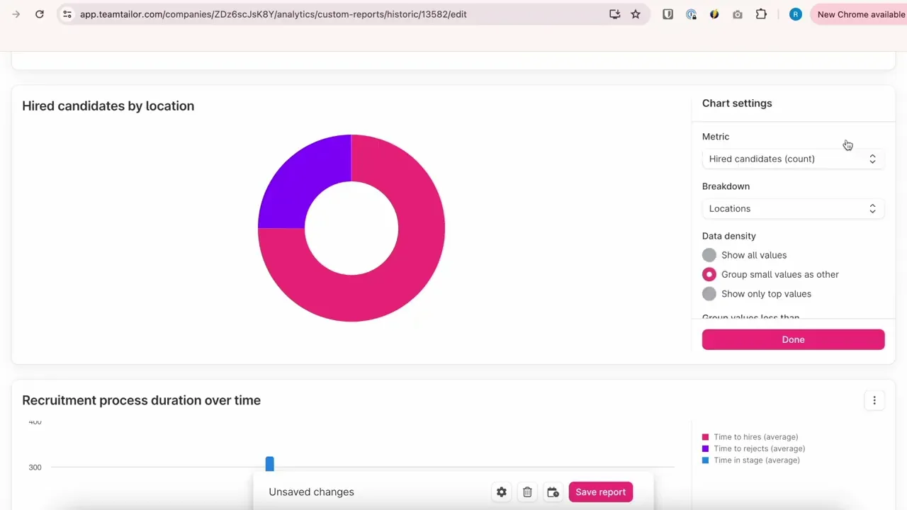
The solution: A report builder where you pick any data you want and choose how to see it, without knowing how a chart works. The hard part was designing it so the complexity is removed from the user's view and handled by the system instead.
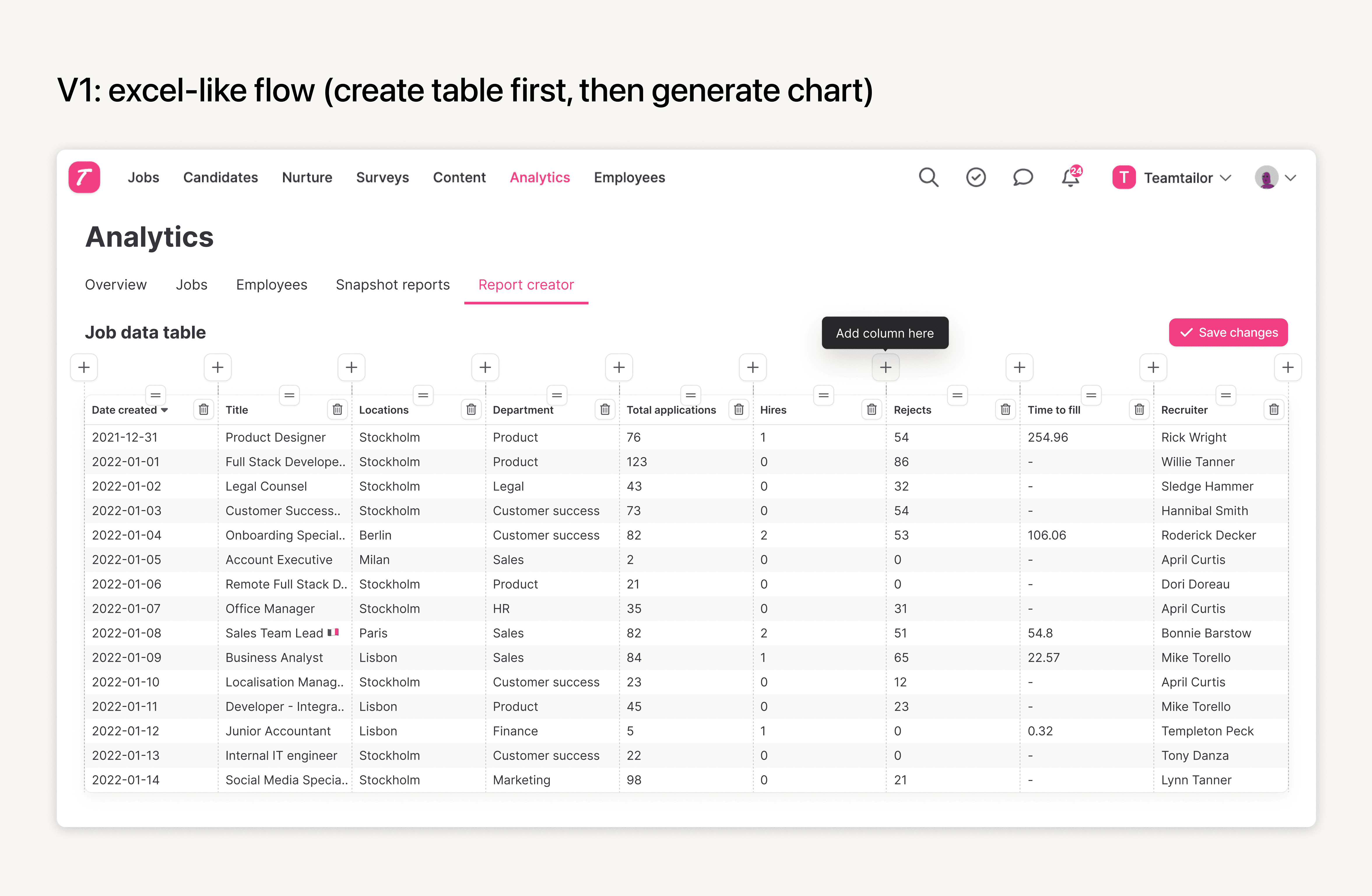
A glimpse at the first version that failed
It worked like Excel: build a table first, then pick which columns to turn into which kind of chart. That is not how these users think. They don't know how to start from a table and what columns to add in order to get the desired result.
How users actually think: They start from a picture in their head. "I want to see how applications grow," which for them is a line chart of applications per day since the job was posted.
So I flipped the flow to match that: You pick the chart first, a bar, a line, whatever. That gives you the widget. Then you set what goes on each axis, with smart defaults keeping it valid.


Impact
Usage rose 31%. To be sure it was real and not just Teamtailor growing, I connected analytics tracking (Google Analytics) to measure active analytics users specifically, then checked engagement growth against overall user growth. The 31% held independent of the company's growth.
Forbes Best Analytics Platform in the ATS category, within a year of the redesign.
The redesigned platform won new enterprise customers, a direct ARR increase.


